Asset Heatmap Report
Objective: Gain an understanding of the Asset Heatmap report.
The Asset Heatmap show's each asset's predicted service state over time. The colours in the heatmap provide a graphical representation of each asset's service state performance over the full duration of a Simulation.
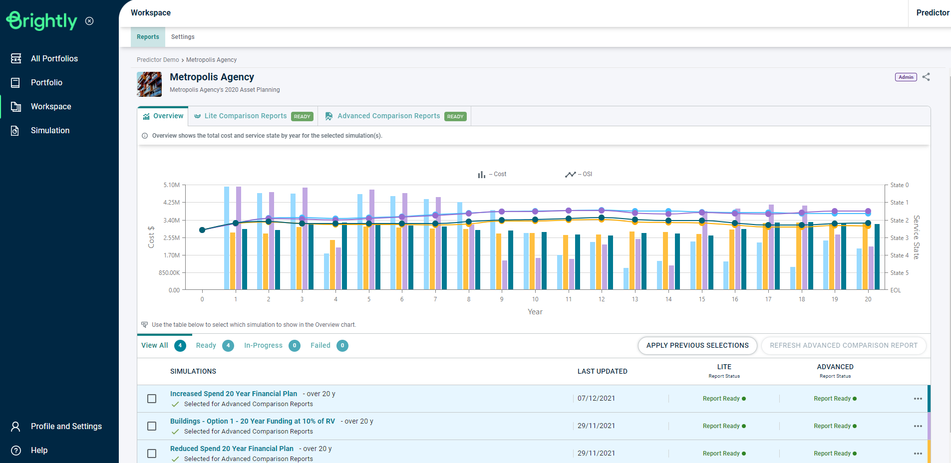
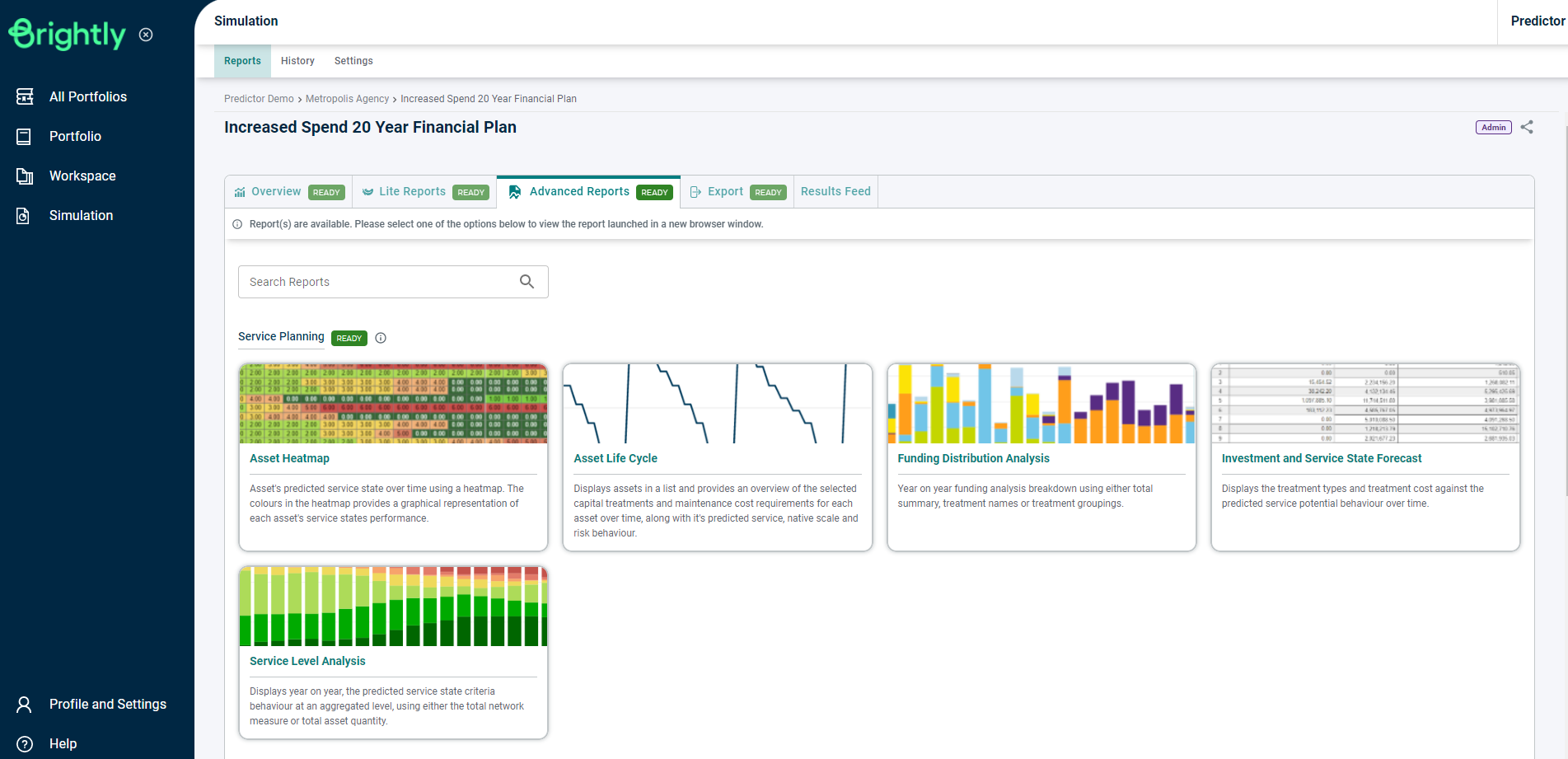
Once the Simulation is loaded, users can click on the 'Asset Heatmap' report in the Advanced Reports tab, under Service Planning section, or use the Search Reports box to locate the correct report.
This will load the Asset Heatmap report, which details each asset's predicted Service State for each year of the simulation. For each Service State value, the cell is colour-coded as a visual indicator of the asset's Service State for that year.
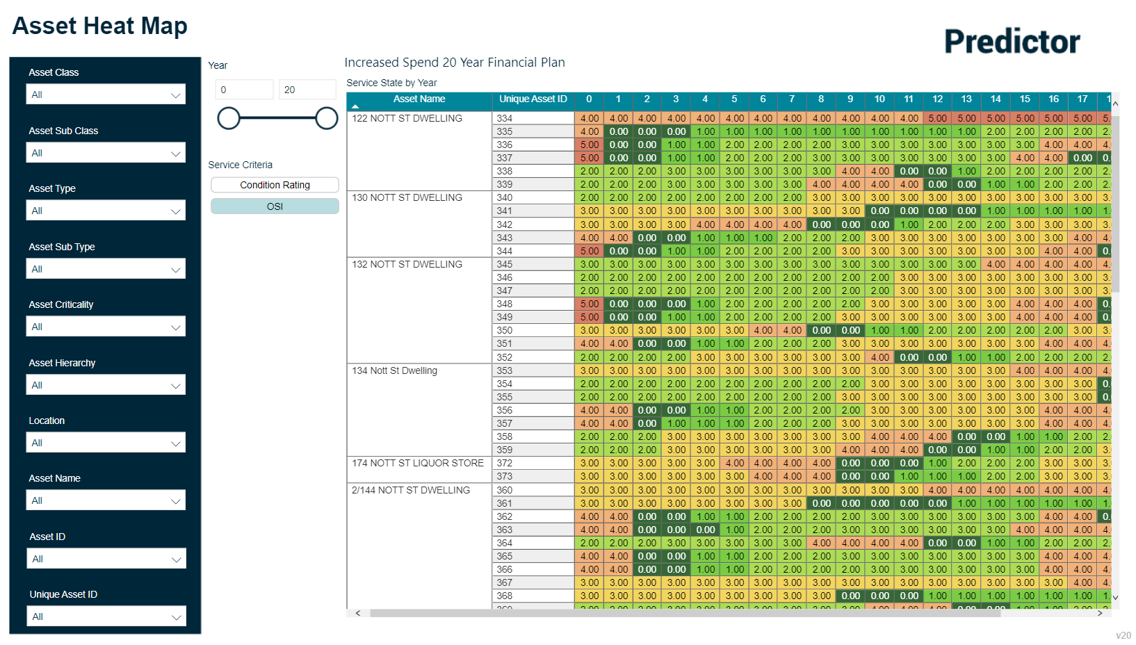
Users can specify which Service Criteria to display using the buttons on the left.