Service Level Analysis
The Service Level Analysis report is one of a number of reports available as a Sample Run in the Desktop App, which is run using a randomly selected 100 Assets, in order to verify and validate a Model's configuration.
The Service Level Analysis report displays the predicted service criteria state at an aggregated level, using either the total network measure or total asset quantity. The report displays the service criteria states in various graphical representations to illustrate the change in service level distribution throughout the financial analysis period of the chosen simulation.
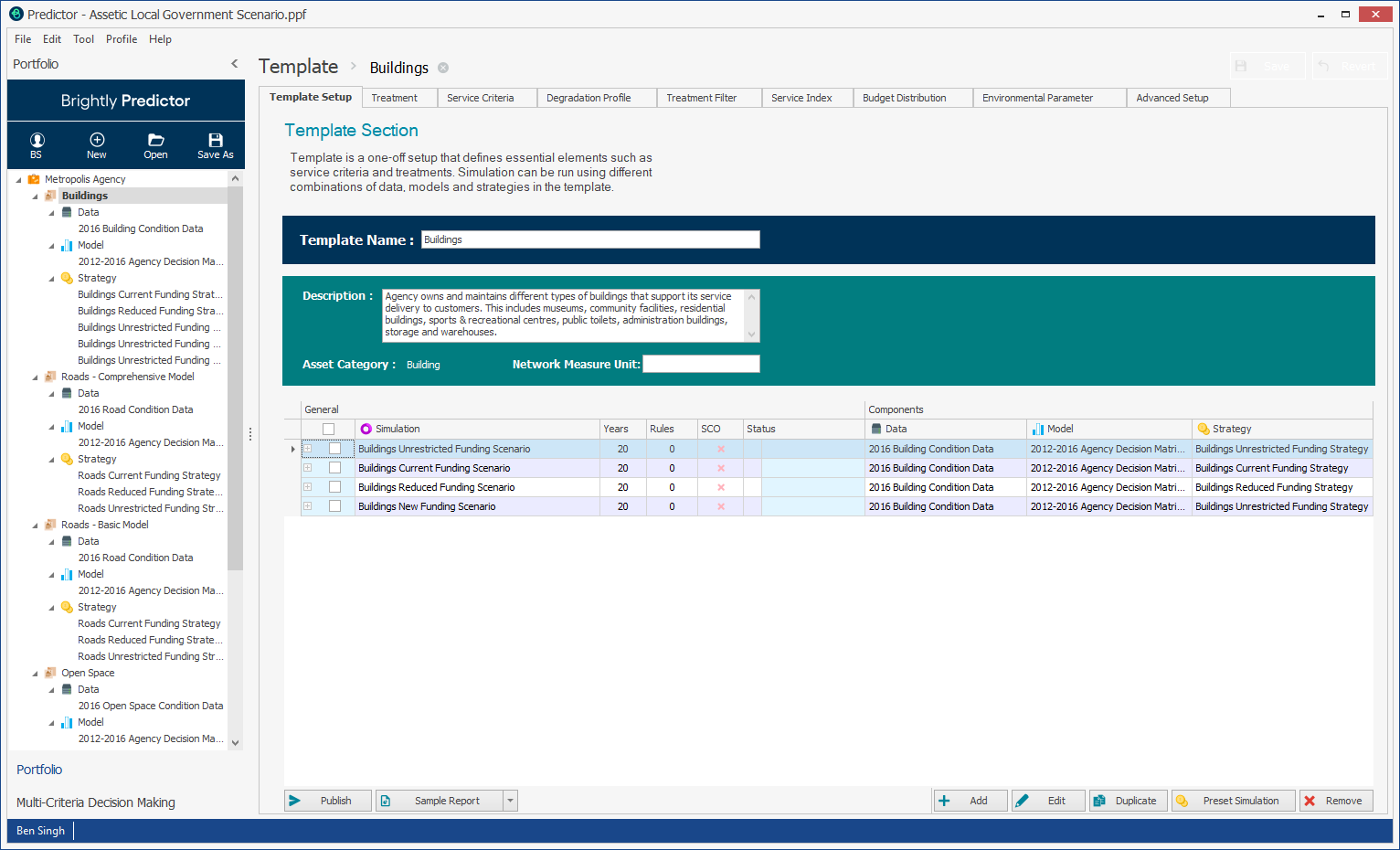
Here, users can select an available simulation, and then click the Sample Report button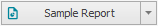 to launch the Report Viewer window. Alternatively, the Service Level Analysis report can be selected from the Sample Report drop-down arrow to launch the report itself immediately.
Predictor will then generate a sample run of the Service Level Analysis report.

The service criteria states can be displayed as graphs for each year of the financial analysis period, as a line chart illustrating the network average over the financial analysis period, or as a total state composition per year in a stacked bar or pie chart.
To view the service state distribution in any given year for any of the available data representations, select the required year in the Service State Distribution table.
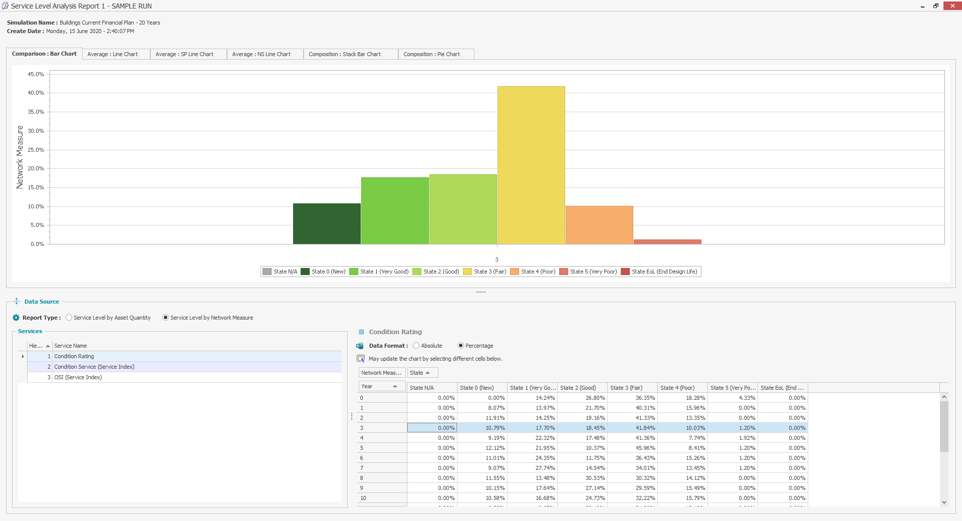
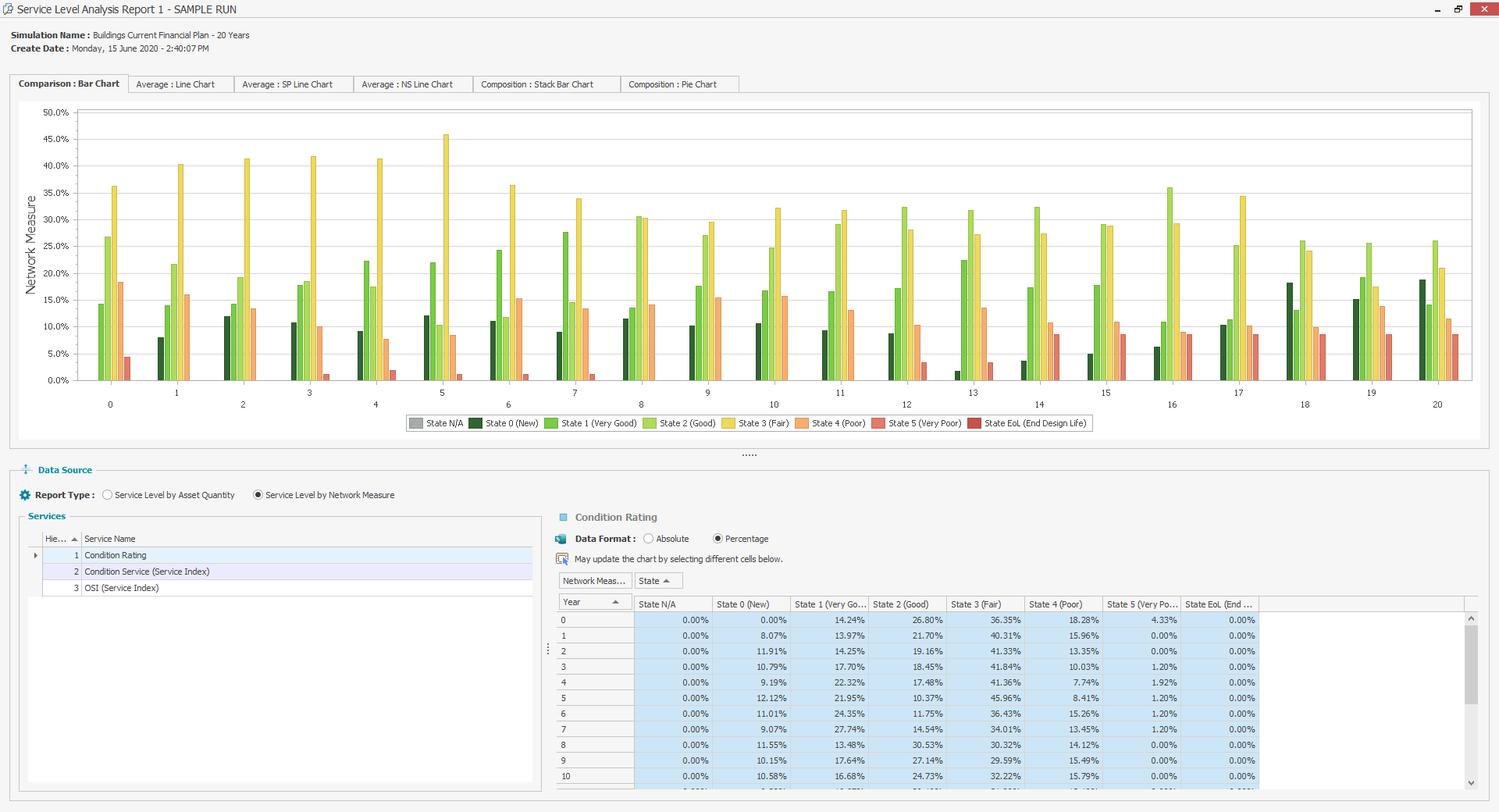
Comparison: Bar Chart
Select the Comparison: Bar Chart and the following screen will appear.
Average: Line Chart
Select the Average: Line Chart tab on the Service Level Analysis report and the following screen will appear.

Note: In calculating average values, service state values for End of Life (EoL) are considered to be a value of 6
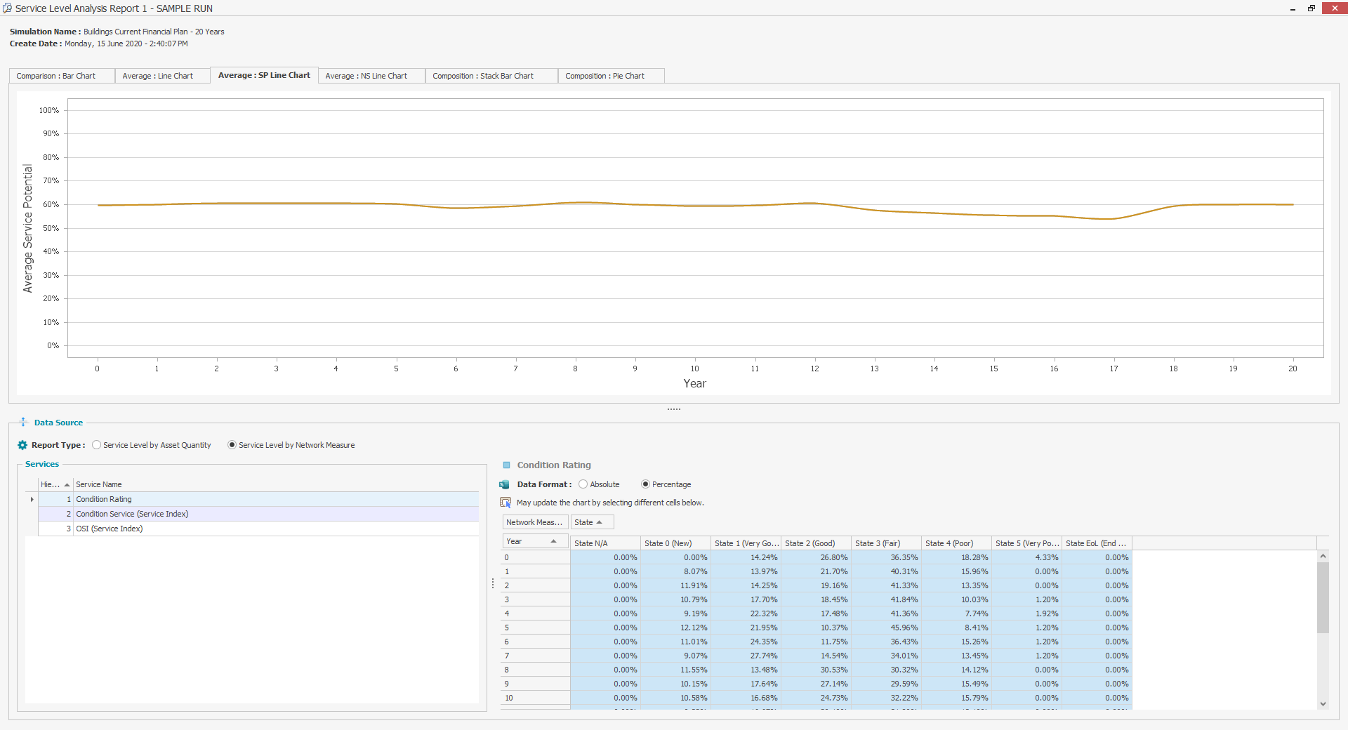
Average: SP Line Chart
Select the Average: SP Line Chart and the following screen will appear.
Average: NS Line Chart
Select the Average: NS Line Chart and the following screen will appear.

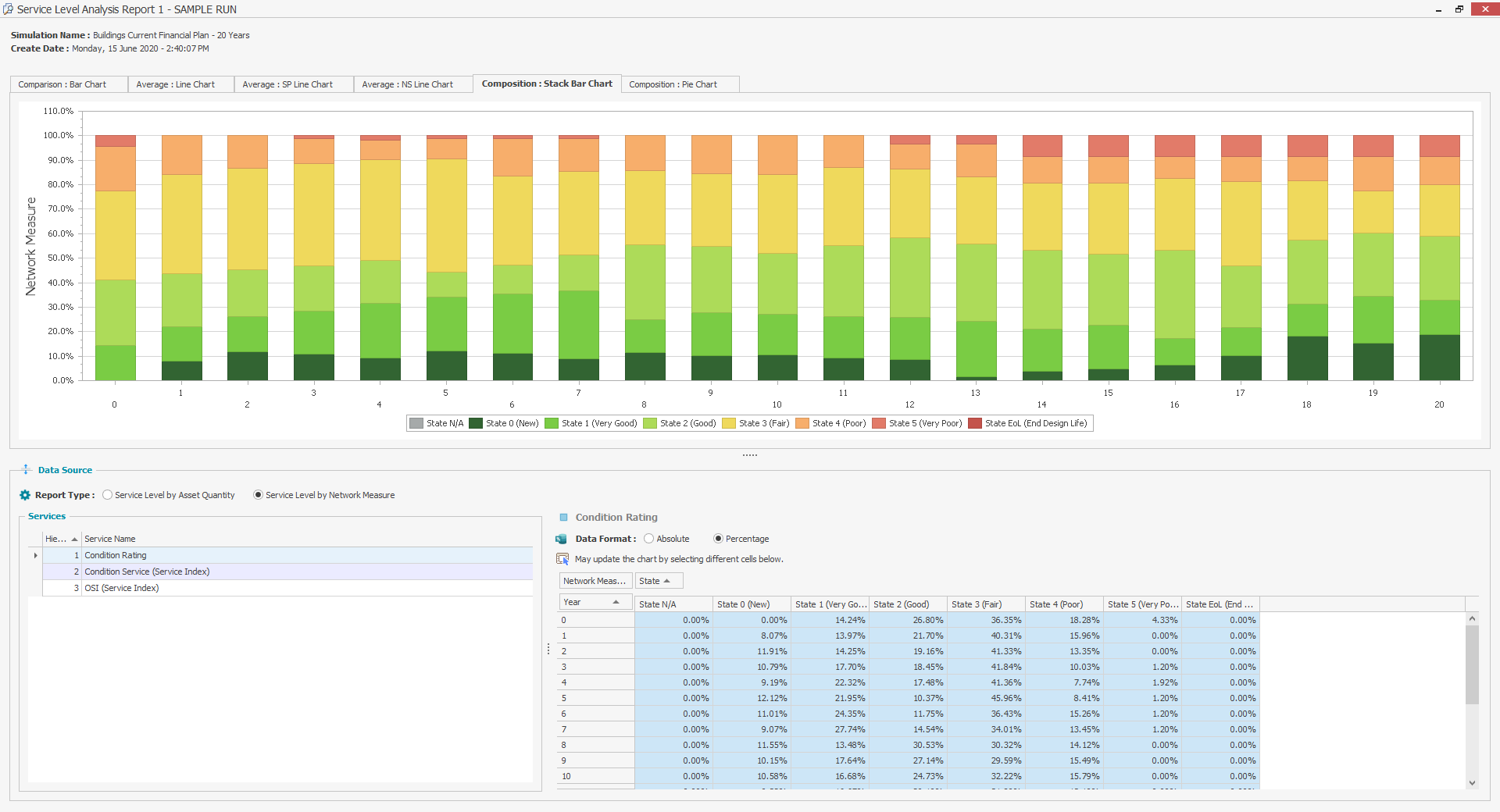
Composition: Stack Bar Chart
Select the Composition: Stack Bar Chart and the following screen will appear.
Composition: Pie Chart
Select the Composition: Pie Chart and the following screen will appear.
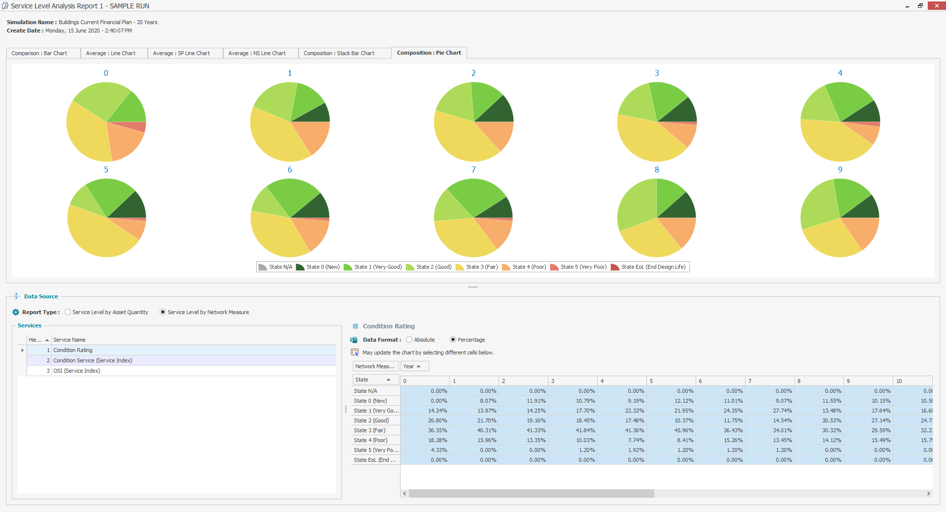
NOTE If the analysis period is long there might not be enough space on the screen to shows pie charts for all of the years.
This sample run report allows users to identify and resolve any issues with their Model, before they publish full simulation results to the Web App, where the full version of the Asset Life Cycle report can be viewed.