Service Level Analysis Report
Objective: Gain an understanding of the Service Level Analysis report
The Service Level Analysis report displays the predicted service criteria state at an aggregated level, using either the total network measure or total asset quantity. The service criteria states can be displayed either as graphs for each year of the financial analysis period, a line chart illustrating the network average over the financial analysis period or total state composition by each year in a stacked bar or pie chart.
Select View Report after selecting Service Level Analysis from the drop-down menu and then selecting the simulation.
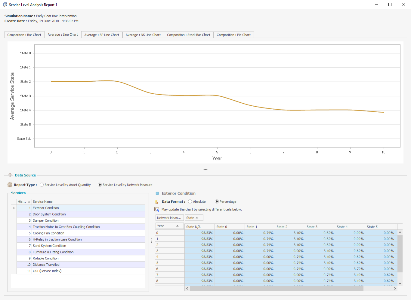
Select the Average: Line Chart tab on the Service Level Analysis report and the following screen will appear.
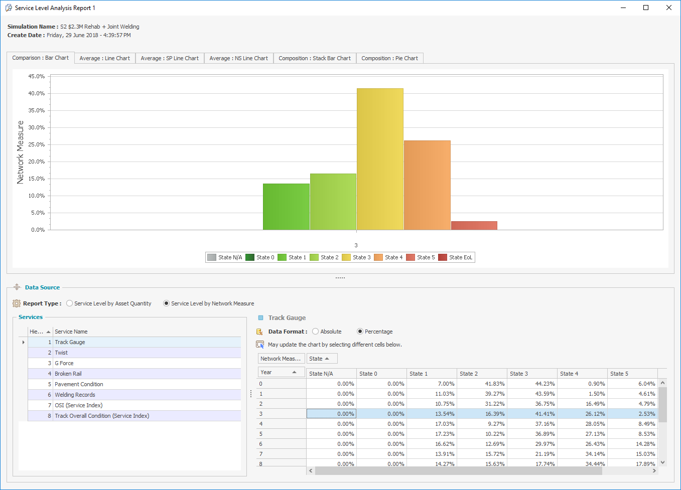
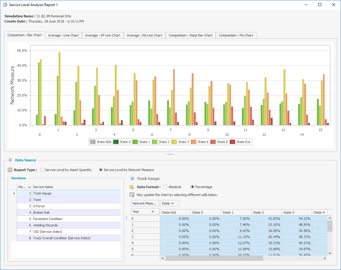
Select the Comparison: Bar Chart and the following screen will appear.
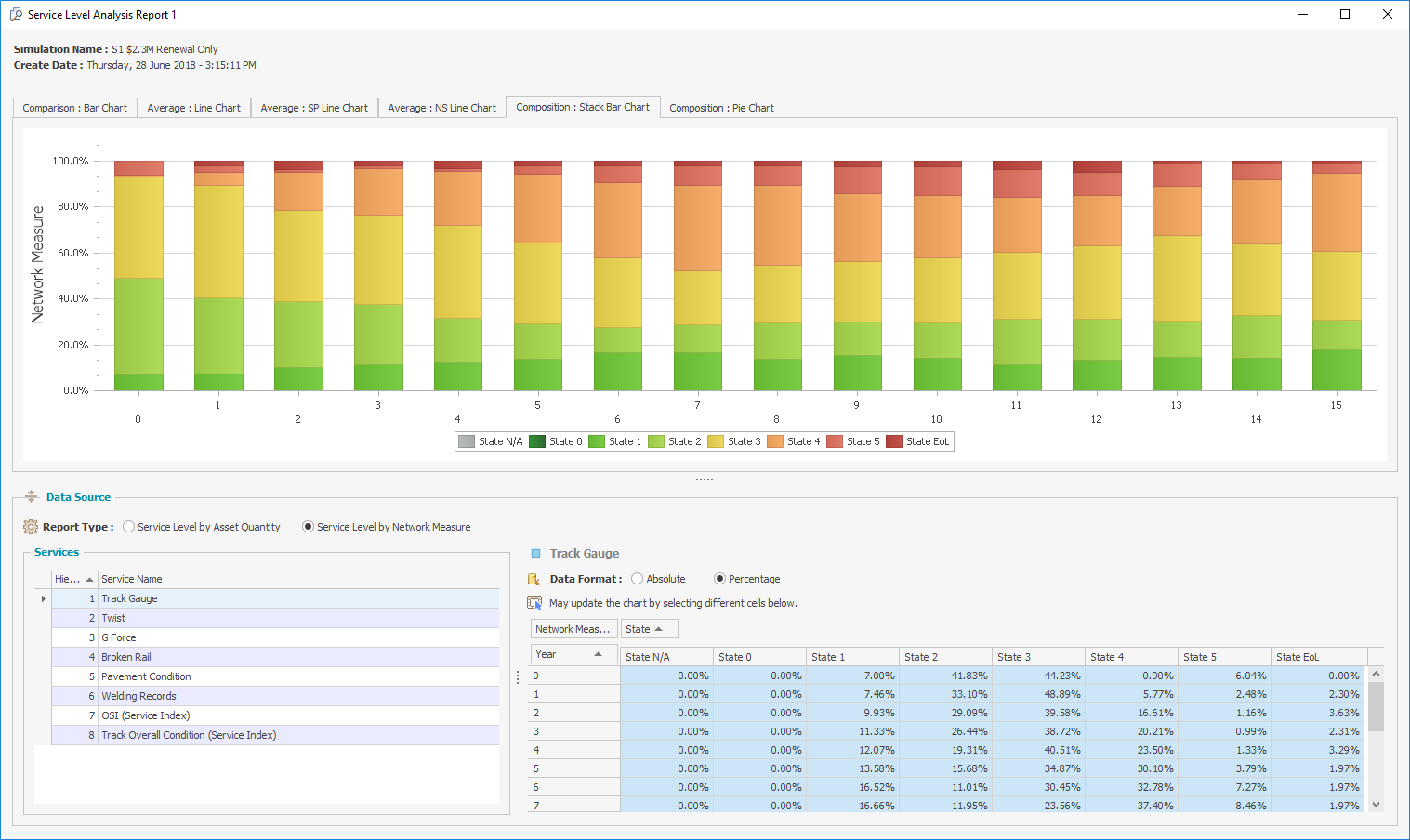
Select the Composition: Pie Chart and the following screen will appear.
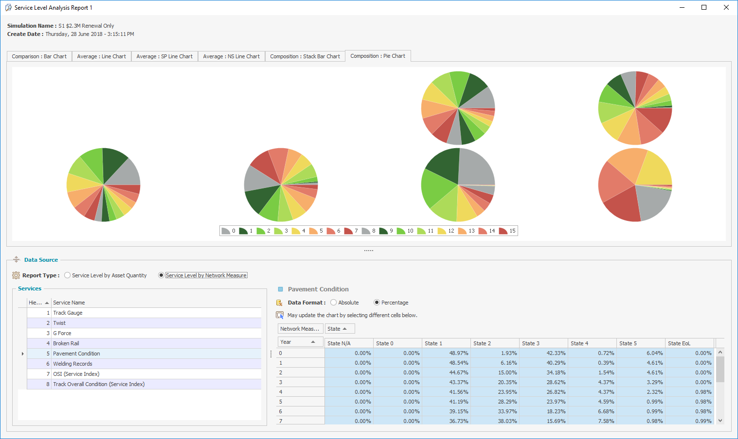
Note: If the analysis period is long there might not be enough space on the screen to shows pie charts for all of the years.
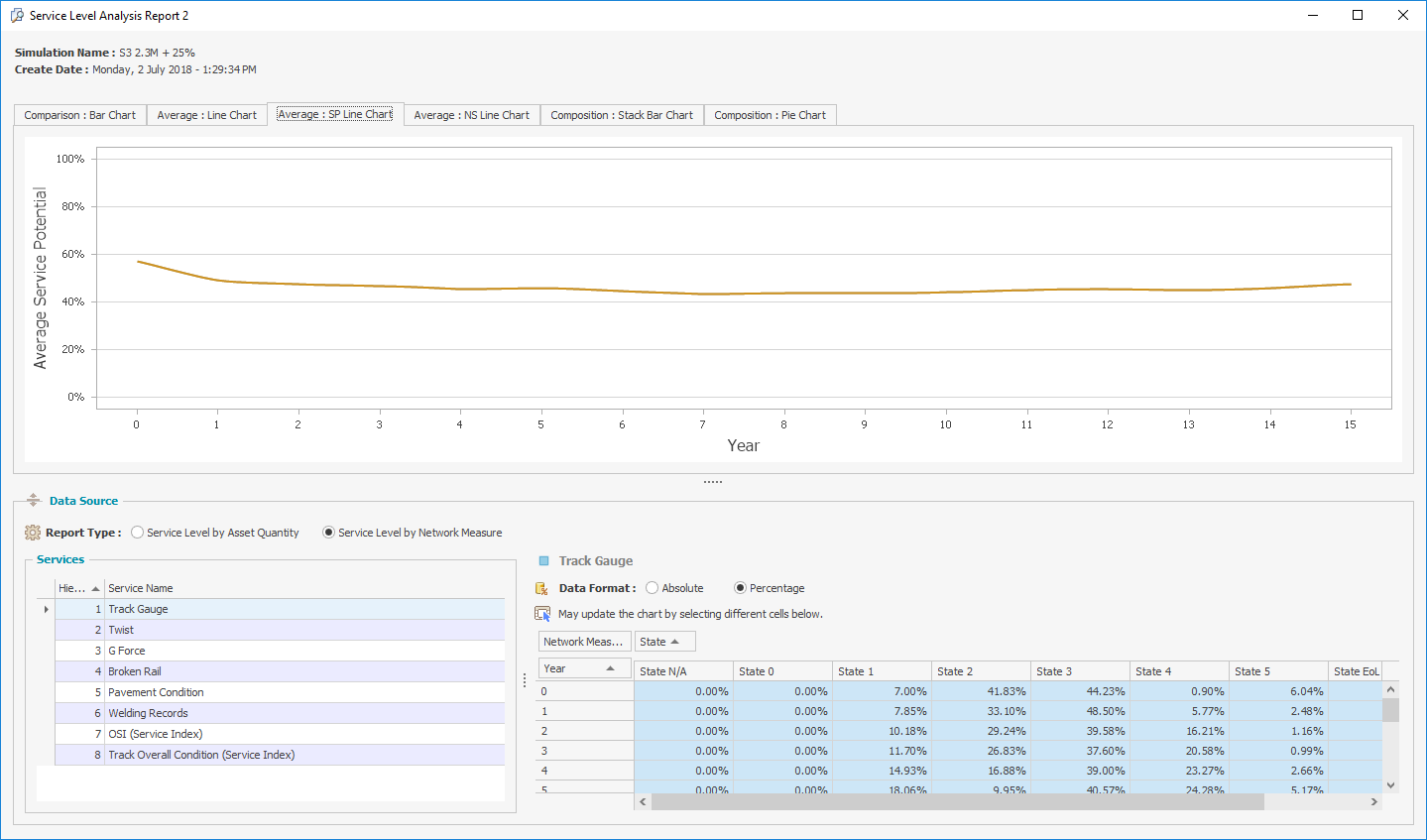
Select the Average: SP Line Chart and the following screen will appear.
Select the Average: NS Line Chart and the following screen will appear.
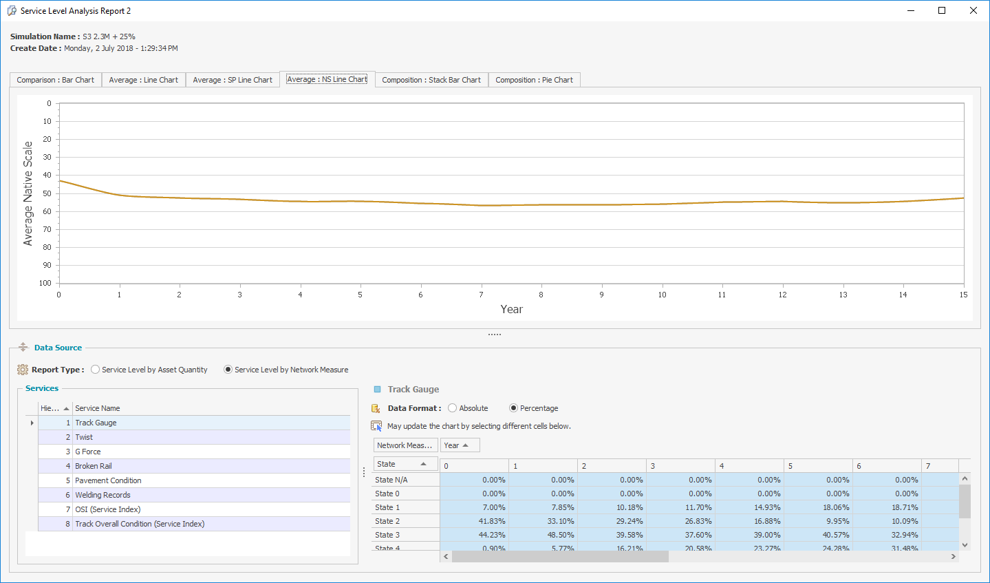
To view the service state distribution in any given year for any of the different representations, select the required year in the Service State Distribution table.